Online Casino Design 2025: The Gambling Industry Trends
Have you ever noticed how on some casino websites everything shines, blinks and... annoys? Half an hour on this portal — and the player is tired of colours and shine. Instead, more serious, professional and decent sites perfectly stand out against the background of such resources. It should be admitted that the design of an online casino may well be solid and thus even more attractive to users.

It is necessary to understand what should be the design of the online casino website to form a positive impression on visitors, to inspire confidence in the site and, as a result, bring more profit.
How a Good Online Casino Website Looks Like
There is a lot of debate and discussion about what resource will gain more gamblers’ visits. Practice shows that both websites with non-typical design and conventional, even formulaic gambling sites can find their own audience. All designs for online casinos are good in their own way, but not all of them are profitable.
The principle that determines the design profitability is simple: the more comfortable the gambler feels on the website, the longer he will stay there and the more bets he will make. The key point is convenience. It makes sense to find out in what way it should be expressed.

Important Aspects You Should Pay Attention to While Developing the Design
- The necessary buttons are always close to hand. In the gambling business, the two most important buttons on the website are “Sign in” and “Deposit”. Let them be accessible from any page of the site and clearly visible. The buttons should be literally at hand when the user decides to take a step towards his/her luck.
- Registration on the website. The simpler the form is, the better it would be. Avoid “bunching” of additional fields and lines for personal information. You can request all of these data later.
- Search for the favourite slots. Experienced gamblers usually know exactly what machine they want to play today. Make sure that any machine can be found on the website in just a couple of clicks. The faster the user starts the game, the sooner he will start to make a profit to your online business.
- Overall visual load. When the website has too many banners, promotional offers and animations, the user is lost and does not always understand how to navigate on the site. Keep a balance: promotional activities are a great marketing move, but let them be no more than two.
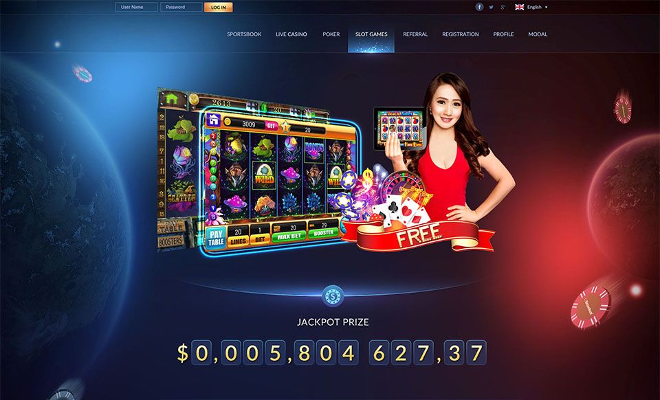
- The game in a real-time mode. Create a feeling of “live” casino: connect jackpots widgets, player ratings, lists of the latest big winnings. Such methods constantly keep visitors in suspense and heighten the interest in gambling. In addition, they give a sense of community with a huge audience of players around the world.
- Licenses and certificates. Are you operating honestly? Do not forget to tell the players about it! It is best to place all the documents on the main page. Let users know after the first visit to your website that transparent gambling business is conducting here.
- Mobile version. The website looks great on a PC or laptop, but on a smartphone it is terrible? No gambler will start betting the money on the site if all this stuff “floats”. Gambling from the smartphone should be as convenient as in a PC browser.
Conclusion
The high-quality design of the web casino will allow gamblers to enjoy the game, and this directly affects the frequency and number of bets.
Focus on simplicity: easy access to the games, quick registration, replenishment of the deposit in a few clicks. Let the user get carried away with the game, instead of learning the navigation or “knocking” on support. This simple principle will help to make your online business exponentially more successful.
Check the information used to contact us carefully. It is necessary for your safety.
Fraudsters can use contacts that look like ours to scam customers. Therefore, we ask you to enter only the addresses that are indicated on our official website.
Be careful! Our team is not responsible for the activities of persons using similar contact details.


